Gapminder country compare analysis
gapminder country comparison
You have seen the gapminder dataset that has data on life expectancy, population, and GDP per capita for 142 countries from 1952 to 2007. To get a glimpse of the dataframe, namely to see the variable names, variable types, etc., we use the glimpse function. We also want to have a look at the first 20 rows of data.
glimpse(gapminder)## Rows: 1,704
## Columns: 6
## $ country <fct> "Afghanistan", "Afghanistan", "Afghanistan", "Afghanistan", …
## $ continent <fct> Asia, Asia, Asia, Asia, Asia, Asia, Asia, Asia, Asia, Asia, …
## $ year <int> 1952, 1957, 1962, 1967, 1972, 1977, 1982, 1987, 1992, 1997, …
## $ lifeExp <dbl> 28.8, 30.3, 32.0, 34.0, 36.1, 38.4, 39.9, 40.8, 41.7, 41.8, …
## $ pop <int> 8425333, 9240934, 10267083, 11537966, 13079460, 14880372, 12…
## $ gdpPercap <dbl> 779, 821, 853, 836, 740, 786, 978, 852, 649, 635, 727, 975, …head(gapminder, 20) # look at the first 20 rows of the dataframe## # A tibble: 20 × 6
## country continent year lifeExp pop gdpPercap
## <fct> <fct> <int> <dbl> <int> <dbl>
## 1 Afghanistan Asia 1952 28.8 8425333 779.
## 2 Afghanistan Asia 1957 30.3 9240934 821.
## 3 Afghanistan Asia 1962 32.0 10267083 853.
## 4 Afghanistan Asia 1967 34.0 11537966 836.
## 5 Afghanistan Asia 1972 36.1 13079460 740.
## 6 Afghanistan Asia 1977 38.4 14880372 786.
## 7 Afghanistan Asia 1982 39.9 12881816 978.
## 8 Afghanistan Asia 1987 40.8 13867957 852.
## 9 Afghanistan Asia 1992 41.7 16317921 649.
## 10 Afghanistan Asia 1997 41.8 22227415 635.
## 11 Afghanistan Asia 2002 42.1 25268405 727.
## 12 Afghanistan Asia 2007 43.8 31889923 975.
## 13 Albania Europe 1952 55.2 1282697 1601.
## 14 Albania Europe 1957 59.3 1476505 1942.
## 15 Albania Europe 1962 64.8 1728137 2313.
## 16 Albania Europe 1967 66.2 1984060 2760.
## 17 Albania Europe 1972 67.7 2263554 3313.
## 18 Albania Europe 1977 68.9 2509048 3533.
## 19 Albania Europe 1982 70.4 2780097 3631.
## 20 Albania Europe 1987 72 3075321 3739.Your task is to produce two graphs of how life expectancy has changed over the years for the country and the continent you come from.
I have created the country_data and continent_data with the code below.
country_data <- gapminder %>%
            filter(country == "China") # just choosing Greece, as this is where I come from

continent_data <- gapminder %>%
            filter(continent == "Asia")
First, create a plot of life expectancy over time for the single country you chose. Map year on the x-axis, and lifeExp on the y-axis. You should also use geom_point() to see the actual data points and geom_smooth(se = FALSE) to plot the underlying trendlines. You need to remove the comments # from the lines below for your code to run.
 plot1 <- ggplot(country_data, mapping = aes(x = year , y = lifeExp))+
   geom_point() +
   geom_smooth(se = FALSE)


#Next we need to add a title. Create a new plot, or extend plot1, using the `labs()` function to add an informative title to the plot.


 plot1<- plot1 +
   labs(title = " Life Expectancy Over Time in China",
       x = "Year ",
       y = "Life Expectancy ")


# plot1
Secondly, produce a plot for all countries in the continent you come from. (Hint: map the country variable to the colour aesthetic. You also want to map country to the group aesthetic, so all points for each country are grouped together).
 ggplot(continent_data, mapping = aes(x = country  , y = lifeExp  , colour= country , group = country))+
   geom_point() +
geom_smooth(se = FALSE) 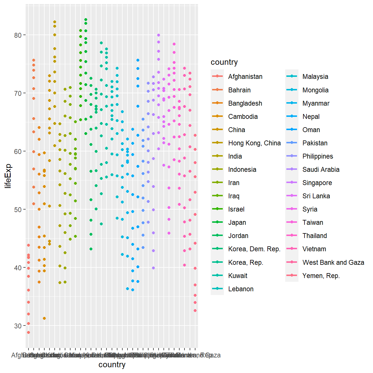
Finally, using the original gapminder data, produce a life expectancy over time graph, grouped (or faceted) by continent. We will remove all legends, adding the theme(legend.position="none") in the end of our ggplot.
ggplot(data = gapminder , mapping = aes(x = year  , y = lifeExp  , colour= continent ))+
   geom_point() +
   geom_smooth(se = FALSE) +
   facet_wrap(~continent) +
theme(legend.position="none") 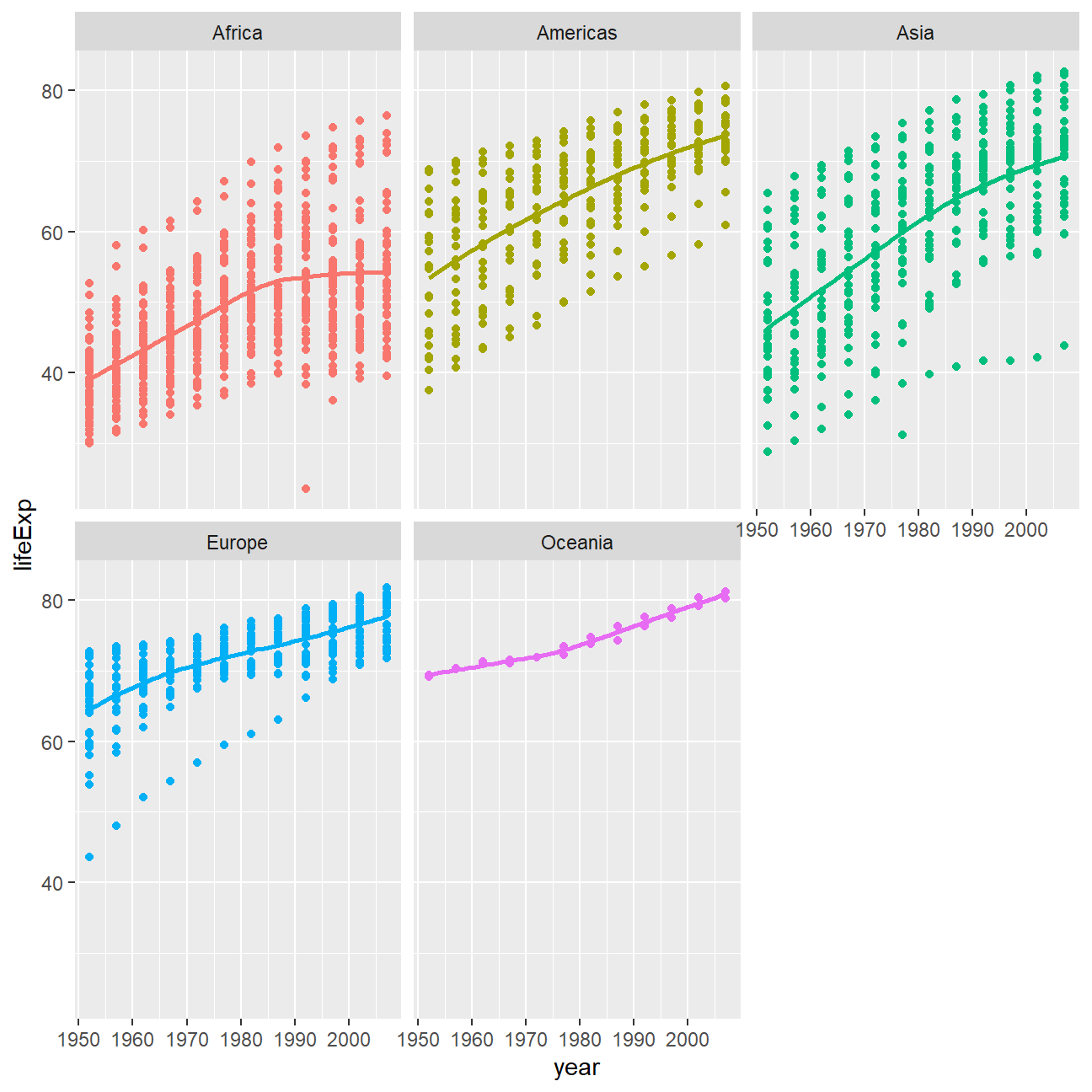
Given these trends, what can you say about life expectancy since 1952? Again, don’t just say what’s happening in the graph. Tell some sort of story and speculate about the differences in the patterns.
Generally speaking, life expectancy across all continents have seen in increase since 1952, though certain countries have had small setbacks in the process. For example, China’s life expectancy had a fall from 1957 to 1967. I think that was because of the “Great Leap Forward Movement”, which caused the Great Chinese Famine and drastically decreased China’s population and life expectancy.